In a nutshell
1. MVRV shows Bitcoin is fairly valued, not overvalued
2. Optimism in the market, per NUPL
3. SOPR shows sellers are breaking even again
4. Exchange flows favour holding over the long run
5. Short-term holders are back in profit
6. Long-term holders have started selling a little
All six signals in one view
What this means for readers


 Part of a series
All of Bitcoin's transactions are recorded publicly. With that public record, you can see what holders paid, whether they are sitting on a profit or loss, and whether coins are moving to an exchange. This public record is called on-chain data, meaning activity recorded directly on the blockchain and visible to anyone.
There is no predictor of price. However, when read together, these six indicators can show if the market is cheap, fair or expensive based on its historical behaviour. Each of the following six sections will show the chart, tell you how to read it, provide our analysis and tell you what it means for you.
MVRV near 1.5. Currently, Bitcoin is trading about 50% above the average holder's cost, far below previous peak levels.
NUPL back in optimism. Bitcoin holders are currently comfortable being in a profit position, but are not showing signs of greed.
SOPR just above 1. Sellers have moved from small loss positions to small profit positions.
Exchange netflow mixed. The last two years showed net outflows, but this week saw net inflows.
Short-term holders in profit. The price is currently trading above their average cost of about $73,000.
Long-term holders selling a little. A pattern seen near previous peaks, though small for now.
Bitcoin trades about 50% above what the average holder paid, well short of past peak levels.
MVRV (Market Value to Realised Value) divides Bitcoin's market price by its realised price. The realised price is the average price at which every coin last moved, so it works as the market's average cost.
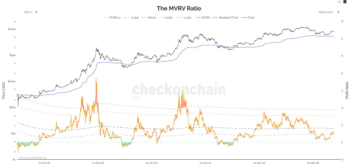
Source: checkonchain.com, The MVRV Ratio. Orange line is MVRV, purple line is realised price, black line is price. Data as of 15 October 2026.
How to read it

Our take
MVRV at 1.5 is in the lower half of its normal range. It's nowhere near overheated, but it's also not in the bargain zone below 1. Peaks have fallen with each cycle, so a hard-and-fast rule like 3.5 would have missed the latest top.
Signal: Neutral to mild positive.
What this means for readers: Treat MVRV like a valuation tool and not a timing tool, and compare it with recent cycles rather than old ones.
Common questions
Holders are showing a healthy profit. Greed is nowhere to be seen, and we are a far cry from the peaks seen previously.
NUPL (Net Unrealised Profit or Loss) represents the share of Bitcoin's total value that is paper profit, meaning gains on coins that holders have not yet sold. The chart colours each reading by market mood.
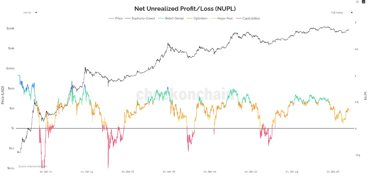
Source: checkonchain.com, Net Unrealized Profit/Loss (NUPL). Line colour marks the mood zone. Data as of 15 October 2026.
How to read it
Our take
The market slipped into hope or fear earlier this year and has climbed back into optimism. NUPL is calculated from MVRV, so the two agree. Its value here is the label attached to the reading, which makes the mood easier to communicate.
Signal: Neutral, inclined slightly positive.
What this means for readers: A move into green would indicate increasing confidence in the market. A move into yellow would represent returning fear.
Common questions
Data shows that the average seller today is making a very small profit, after many sales were made at a loss earlier this year.
SOPR (Spent Output Profit Ratio) compares the price a coin sells at with the price it was last bought at. Put simply, it shows whether sellers are making or losing money. We use the 7-day average to eliminate day-to-day noise.
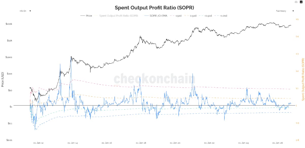
Source: checkonchain.com, Spent Output Profit Ratio (SOPR). Blue line is the 7-day average, black line is price. Data as of 15 October 2026.
How to read it
Our take
The fear that pushed sellers into losses earlier this year has eased. The next test will be whether SOPR bounces off 1 on the next dip, or slips back below it.
Signal: Neutral, slowly improving.
What this means for readers: Bounces from 1 point to a healthy market. Repeated failures at 1 point to lasting market weakness.
Common questions
More Bitcoin has left exchanges than flowed in over the last 2 years. However, exchange inflows outweighed outflows this week.
An exchange is a platform where users buy and sell crypto, similar to a stock broker app. Exchange netflow is the amount of Bitcoin flowing onto exchanges minus the amount flowing off them. Coins usually go to an exchange to be sold, and leave one to be held in a personal wallet.
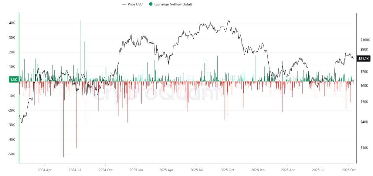
Source: CryptoQuant, Bitcoin Exchange Netflow (Total), all exchanges, daily. Free data covers January 2024 to 15 October 2026.
How to read it
Our take
Outflows have outweighed inflows since 2024, and several of the largest came right after price dips, which points to buyers stepping in. The recent run of inflows suggests some holders may be preparing to sell.
Signal: Positive long term, slightly cautious short term.
What this means for readers: A sustained switch from red to green bars would be an early warning worth watching.
Common questions
Recent buyers paid about $73,000 on average, and Bitcoin now trades above that level.
Short-term holders are wallets that have held their coins for less than about 155 days, roughly five months. Their realised price is the average price they paid. The ratio in the lower panel divides today's price by that average.
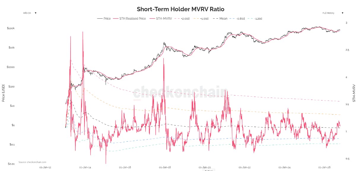
Source: checkonchain.com, Short-Term Holder MVRV Ratio. Upper red line is the short-term holder realised price, lower red line is the ratio. Data as of 15 October 2026.
How to read it
Our take
Newer buyers are back in profit after months underwater. This level often acts as a floor in healthy markets, so holding above about $73,000 matters more than any other line in this issue.
Signal: Mildly positive.
What this means for readers: A break below about $73,000 would put recent buyers back in loss and raise the risk of panic selling.
Common questions
After holding a record amount earlier this year, the most patient investors trimmed positions over the past month.
Long-term holders are wallets that have held their coins for more than about 155 days. This chart shows how much their combined holdings grew or shrank over the past 30 days.
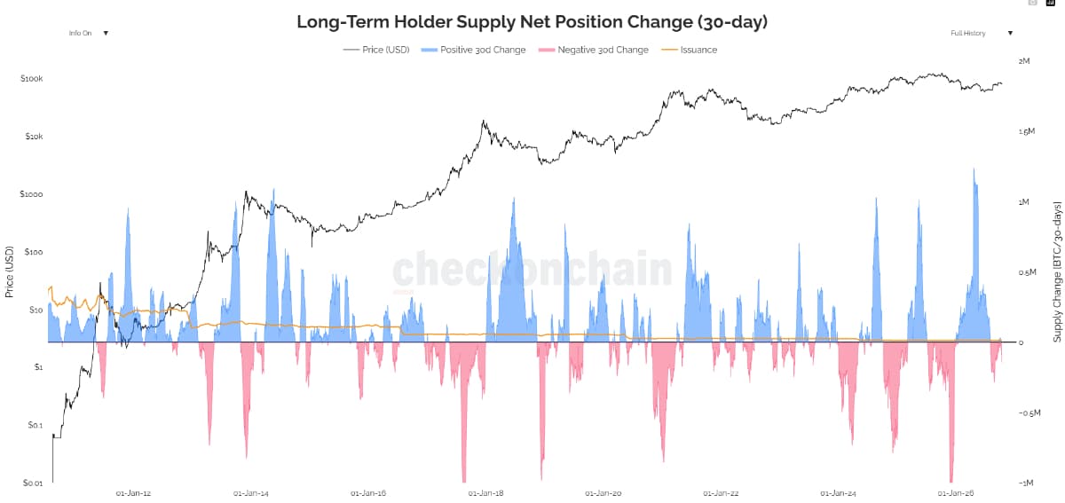
Source: checkonchain.com, Long-Term Holder Supply Net Position Change (30-day). Data as of 15 October 2026.
How to read it
Our take
Some long-term holders have been seen selling during the recent price increase. While the amounts are small compared with past tops, this group has a track record of selling near peaks.
Signal: Neutral. Watch for further signs.
What this means for readers: A deeper pink wave would be the best evidence of patient capital taking profit.
Common questions
The scorecard places each reading side by side. Green means a positive signal, gold means a neutral signal, and red means a signal to watch closely.
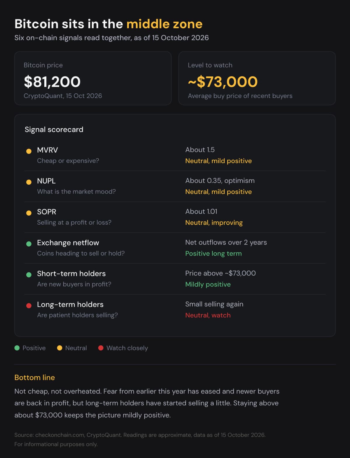
Bitcoin is in middle territory, and the $73,000 level is the one to watch.
Three signals sit at neutral, two lean positive, and one calls for caution. The fear from earlier this year has eased, and newer buyers are back in profit. Against that, long-term holders have started selling a little, and coins are flowing onto exchanges this week.
Three things would change the picture. A slide below $73,000 would put recent buyers back in loss. A deeper pink wave from long-term holders would indicate patient money taking profits. A move of NUPL into green would show confidence building.
India Crypto Research operates independently. The information presented herein is intended solely for educational and informational purposes and should not be construed as financial advice. Before making any financial decisions, it's essential to undertake your own thorough research and analysis. If you're uncertain about any financial matters, we strongly recommend seeking guidance from an impartial financial advisor.